
Setting the Stage: Understanding Music Poster Design Fundamentals
Hey there, fellow designers! Let’s kick things off with a bang. Y’know, there’s something magical about creating the perfect music poster – it’s like composing a visual symphony that captures the very essence of sound. As someone who’s spent countless hours perfecting this craft, I can tell you that music poster design isn’t just about slapping some text on a pretty background.
The thing is, effective music poster design requires a deep understanding of both visual principles and musical context. You’ve gotta consider the genre, the venue, the audience, and oh boy, don’t even get me started on the importance of hierarchy! It’s all about creating that perfect harmony between information and aesthetics.
The Building Blocks of Striking Music Poster Design
Typography That Rocks
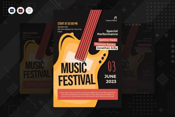
Listen up, ’cause this is crucial! Your type choices can make or break a music poster. Whether you’re designing for a classical concert or a heavy metal gig, typography sets the tone (pun intended!). Here’s what you need to nail:
- Font Pairing: Mix display fonts with legible secondary typefaces
- Hierarchy: Ensure the band name and date stand out
- Readability: Keep essential info clear, even from a distance
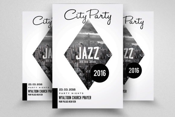
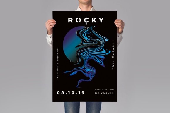
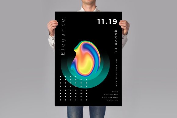
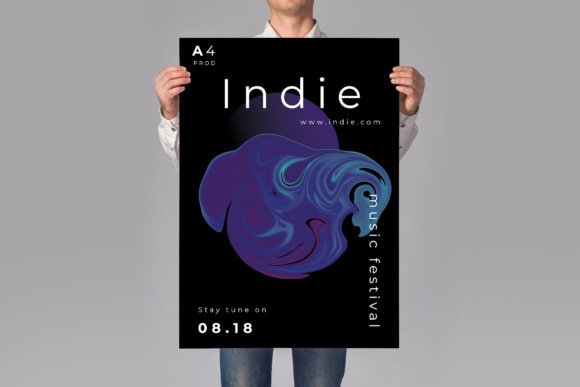
Color Psychology in Music Poster Design
Colors aren’t just pretty – they’re powerful communicators. Different genres typically associate with different color palettes:
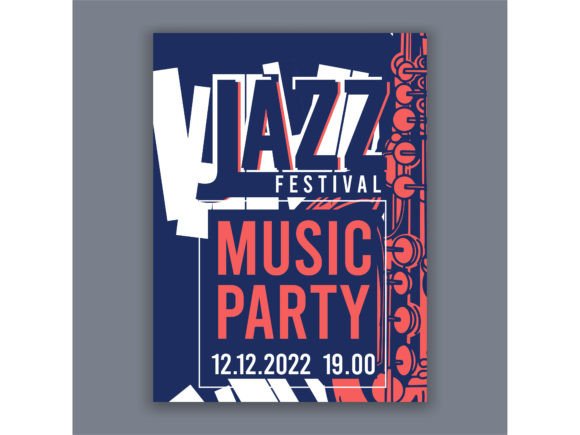
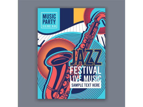
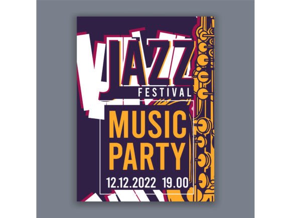
- Jazz: Deep purples, golds, and blacks for sophistication
- Rock: High-contrast combinations with bold reds and blacks
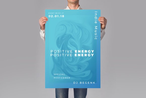
- Electronic: Neon colors and gradients
- Classical: Elegant metallics and subdued tones
Technical Considerations and Best Practices
When you’re diving into music poster design, you’ve gotta keep some technical stuff in mind. First off, always work in CMYK if you’re heading to print (trust me, I learned this one the hard way!). And remember, your poster needs to look good both up close and from across the street.
Resolution matters big time – 300 DPI is your best friend for print work. Oh, and don’t forget about bleed areas! Nothing’s worse than important elements getting chopped off at the printer.
Emerging Trends in Music Poster Design
Digital Integration
These days, music poster design isn’t just about physical prints anymore. We’re seeing some wild innovations:
- AR-enhanced posters that come alive through smartphone apps
- QR codes seamlessly integrated into designs
- Animated versions for social media promotion
Sustainable Design Approaches
Going green isn’t just trendy – it’s necessary! More designers are opting for:
- Eco-friendly printing materials
- Digital-first distribution strategies
- Minimalist designs that use less ink
Frequently Asked Questions
Q: What size should my music poster be? A: Standard sizes vary, but 18×24 inches and 24×36 inches are industry favorites. Always check with your venue and printer first!
Q: How do I ensure my poster is printable? A: Work in CMYK, maintain 300 DPI resolution, and include a 0.125-inch bleed area. When in doubt, chat with your printer.
Q: Should I include social media handles? A: Absolutely! In today’s connected world, social media info is crucial for engagement and ticket sales.
The Grand Finale: Your Next Steps
Alright, let’s wrap this party up! Creating killer music posters is an art form that combines technical skill with creative expression. Remember, every great poster tells a story – make sure yours is worth hearing.
Keep experimenting, stay true to the music’s spirit, and don’t be afraid to break some rules along the way. After all, some of the most iconic music posters in history came from designers who dared to think differently.