

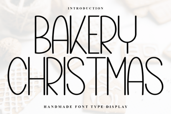
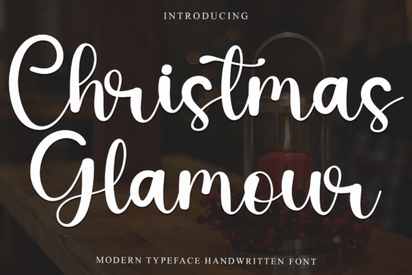
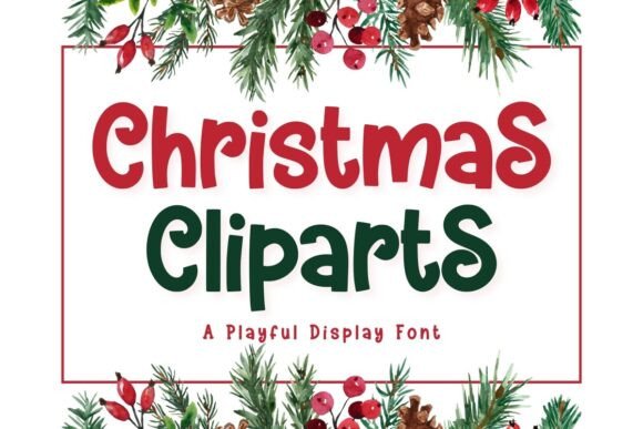
In this guide, we’re diving headfirst into 25 festive Christmas fonts on Canva to deck your designs. I’ve handpicked these beauties to cover every style imaginable—classic, modern, whimsical, you name it. Plus, I’ll share some insider tips on pairing them, using them effectively, and making sure your holiday content doesn’t just look good—it looks phenomenal. Ready? Let’s sleigh this thing!
Why Typography Matters During the Holiday Season
The Emotional Connection of Festive Fonts
Here’s something most folks don’t think about: fonts carry feelings. Seriously! Research in typography psychology shows that different typefaces evoke distinct emotional responses, with decorative fonts particularly effective at creating seasonal associations and nostalgic connections (Fonts In Use). When someone sees a swoopy, elegant script or a font dusted with snowflakes, their brain immediately goes, “Aha! Christmas time!”
Think about it. Your favorite holiday memories probably include specific visuals—maybe your grandma’s handwritten recipe cards or those vintage department store window displays. Fonts tap into that same emotional reservoir. They’re not just letters; they’re mood-setters. A well-chosen Christmas font can transport your audience straight to a cozy fireplace scene or a bustling holiday market. And in today’s oversaturated digital landscape? That emotional hook is absolutely priceless.
Standing Out in a Crowded Digital Space
The holiday season is basically the Super Bowl of content creation. Everyone—and I mean everyone—is pushing out festive posts, ads, and designs. Your competition isn’t just other businesses; it’s Uncle Jerry’s cookie recipe posts and your neighbor’s holiday party invites. So how do you cut through that noise? You guessed it: killer typography.
Using unique, festive Christmas fonts on Canva gives your designs instant personality. Instead of blending into the endless scroll of red and green templates, your content becomes memorable. It’s like showing up to a holiday party in a statement sweater versus a plain hoodie. Both are fine, but only one makes people go, “Whoa, where’d you get that?” And let’s be real—in marketing, “whoa” translates to clicks, shares, and conversions.
The Ultimate List: 25 Festive Christmas Fonts on Canva
Elegant Script Fonts for Sophisticated Designs
1. Allura This flowing script font is pure elegance in pixel form. Allura’s delicate curves and generous loops make it perfect for upscale holiday invitations, wine labels, or any project that needs a touch of class. Pair it with gold accents, and boom—you’ve got instant sophistication.
2. Great Vibes Want something that screams “festive fancy”? Great Vibes delivers smooth, connected letters that look hand-calligraphed. It’s ideal for wedding-style Christmas cards or boutique branding during the holiday season.
3. Pinyon Script With its vintage charm and classic proportions, Pinyon Script brings old-world elegance to modern designs. Think Victorian Christmas aesthetics—perfect for historical themes or nostalgic holiday campaigns.
4. Allison This modern calligraphy font strikes the perfect balance between formal and friendly. Allison works beautifully for product packaging, social media graphics, or any design where you want warmth without sacrificing style.
5. Birthstone Bouncy, playful, yet still refined—Birthstone is that friend who can dress up or down. Use it for holiday blog headers, email signatures, or anywhere you need approachable elegance.
Bold Display Fonts That Command Attention
6. Bungee Inline Retro vibes, anyone? Bungee Inline brings that vintage neon sign energy to your Christmas designs. It’s bold, it’s quirky, and it absolutely refuses to be ignored. Perfect for sales announcements or party flyers.
7. Fredoka One Round, chunky, and irresistibly cheerful—Fredoka One is like a snowman in font form. This baby works wonders for kid-friendly designs, toy advertisements, or anything targeting families.
8. Righteous Strong geometric shapes give Righteous serious presence. When you need your message to punch through, this display font delivers. Great for bold headlines and attention-grabbing CTAs.
9. Titan One Thick, sturdy, and commanding—Titan One doesn’t whisper; it announces. Use this heavyweight for impactful statements like “Holiday Sale” or “Christmas Spectacular.”
10. Bowlby One SC This all-caps stunner brings serious authority to your designs. It’s got that blocky, substantial feel that works perfectly for masculine-leaning holiday content or industrial-chic aesthetics.
Whimsical and Playful Options
11. Luckiest Guy Fun fact: this font literally makes everything look more exciting. Luckiest Guy’s comic book styling adds instant energy to any design. Kids’ holiday events? Check. Casual party invites? Double-check.
12. Chewy Soft, rounded edges make Chewy feel like a warm hug in font form. It’s approachable, friendly, and perfect for small businesses wanting to connect authentically with their audience.
13. Baloo Paaji This quirky handwritten-style font brings personality by the bucketload. Baloo Paaji works brilliantly for casual social media posts, blog graphics, or anywhere informality is your friend.
14. Patrick Hand Literally looks like handwriting—because it basically is! Patrick Hand creates that personal, intimate feel that’s gold for heartfelt holiday messages or personal brand content.
15. Crafty Girls Adorable, hand-drawn, and utterly charming—Crafty Girls screams DIY aesthetic. If your brand leans toward homemade, artisanal, or craft-focused content, this font is your new bestie.
Classic and Traditional Choices
16. Cinzel Inspired by Roman inscriptions, Cinzel brings timeless elegance to Christmas designs. It’s got that “classic literature” vibe that works beautifully for traditional holiday messaging or luxury brands.
17. Playfair Display High-contrast serifs give Playfair Display serious editorial credibility. Use it when you want your holiday content to feel prestigious, established, and trustworthy.
18. Libre Baskerville Web-optimized but traditionally rooted, Libre Baskerville bridges old and new beautifully. It’s readable, respectable, and reliable—perfect for longer holiday messages or blog content.
19. Cormorant Garamond Delicate, refined, and utterly sophisticated—this font family offers multiple weights for versatile design options. Cormorant Garamond shines in high-end holiday catalogs or premium product presentations.
20. Merriweather Designed specifically for screen readability, Merriweather still maintains classic charm. It’s your go-to for email newsletters, blog posts, or any text-heavy holiday content.
Modern and Contemporary Styles
21. Montserrat Clean, geometric, and endlessly versatile—Montserrat is that reliable friend who fits into any situation. Modern minimalist Christmas designs? Absolutely nailed.
22. Raleway Elegant thin strokes give Raleway a sophisticated, contemporary feel. It pairs beautifully with almost anything and works across multiple holiday design styles.
23. Poppins Geometric but friendly, Poppins brings modern professionalism without feeling cold. It’s become a go-to for brands wanting contemporary holiday aesthetics that still feel approachable.
24. Bebas Neue All-caps, condensed, and commanding—Bebas Neue makes statements. Use it for impactful holiday headlines or anywhere you need modern, bold typography.
25. Oswald Slightly condensed with strong vertical emphasis, Oswald delivers contemporary gravitas. It’s perfect for modern holiday campaigns that need substance and style.
How to Choose the Right Christmas Font for Your Project
Match Your Font to Your Brand Personality
Listen, not every Christmas font works for every business. A law firm probably shouldn’t use bouncy comic fonts, and a children’s toy company might struggle with ultra-formal serifs. Your font choice needs to align with your brand’s overall personality and voice.
Start by asking yourself: What’s my brand’s vibe? Playful? Professional? Luxurious? Eco-conscious? Once you’ve nailed that down, selecting from these 25 festive Christmas fonts on Canva becomes way easier. For instance, if you’re a yoga studio promoting holiday classes, something like Allison or Great Vibes maintains your zen aesthetic while adding seasonal flair. Meanwhile, a tech startup announcing holiday deals might lean toward Montserrat or Bebas Neue for that modern edge.
Consider Your Audience Demographics
Who’s reading your content? This matters more than you’d think. Typography research indicates that different age groups and demographics respond more favorably to specific font styles, with younger audiences generally preferring modern, bold typefaces while older demographics tend toward traditional serif fonts (Adobe Fonts).
If you’re targeting Gen Z with holiday promotions, playful and bold fonts like Luckiest Guy or Fredoka One hit different. They speak the visual language of memes, TikTok, and digital-native content. Conversely, if your audience skews older or more traditional, classic choices like Cinzel or Playfair Display resonate better. They signal reliability, tradition, and timelessness—all values that matter to more conservative demographics.
Expert Tips for Using Christmas Fonts Effectively
The Golden Rule: Limit Your Font Choices
Okay, I’m about to save you from the biggest typography mistake ever: using too many fonts. Seriously, just because Canva offers hundreds of options doesn’t mean you should treat your design like a font buffet. Stick to 2-3 fonts maximum per project.
Here’s a winning formula: Pick one decorative Christmas font for your main headline, use a clean sans-serif (like Montserrat or Poppins) for subheadings, and keep body text simple with something highly readable like Merriweather. This creates visual hierarchy without giving your audience decision fatigue. Plus, it looks professional instead of chaotic—and trust me, chaotic isn’t the holiday vibe you’re going for unless you’re designing a Where’s Waldo party invite.
Pair Fonts with Complementary Weights
Font pairing isn’t rocket science, but it does require some finesse. The easiest trick? Use fonts from the same family but in different weights. For example, Poppins offers everything from thin to bold—you can create entire hierarchies without ever leaving the font family.
When mixing different font families, aim for contrast. Pair a decorative script like Allura with a solid sans-serif like Raleway. The fancy script handles the emotional heavy lifting while the clean sans-serif keeps everything grounded and readable. It’s like pairing wine with cheese—you want flavors that complement, not compete.
Mind Your Spacing and Sizing
Nothing kills a beautiful font faster than poor spacing. Those gorgeous Christmas fonts on Canva deserve room to breathe! Don’t cram text together like you’re rationing pixels. Generous spacing—both between letters (tracking) and lines (leading)—makes everything more readable and visually appealing.
Size matters too, folks. Your headline font should be significantly larger than your body text—we’re talking at least 2-3 times bigger. This creates clear visual hierarchy and guides your reader’s eye through the content naturally. And please, please make sure your text is actually readable at the size it’ll be viewed. That adorable intricate font might look amazing at 72pt but become an illegible blob at 12pt.
Practical Applications: Where to Use These Festive Fonts
Social Media Graphics That Stop the Scroll
Instagram, Facebook, Pinterest—these platforms are absolutely drowning in holiday content right now. Your posts need to grab eyeballs immediately, and bold Christmas fonts are your secret weapon. Use attention-grabbing options like Titan One or Bungee Inline for promotional posts about sales or events.
For Instagram Stories, mix playful fonts like Chewy or Baloo Paaji with Canva’s animation features to create dynamic, engaging content. Pinterest pins benefit from elegant scripts like Allura or Great Vibes paired with beautiful holiday imagery—think cozy, aspirational vibes that make people want to save and share. Remember, social media moves fast, so your typography needs to communicate your message in seconds flat.
Holiday Email Marketing Campaigns
Email might seem old-school, but it’s still crushing it for ROI—especially during the holidays. Your subject lines and header graphics need festive fonts that create excitement the moment someone opens your message. Just remember: many email clients have font limitations, so your fancy Canva design might need to be exported as an image.
Create eye-catching email headers using bold display fonts like Fredoka One or Righteous. These work brilliantly for announcing flash sales, special offers, or holiday events. For the actual email body text, stick with web-safe fonts or ensure your design elements are images. Pro tip: Use festive fonts strategically in headers and buttons, but keep paragraph text simple for maximum readability across all devices.
Print Materials: Cards, Flyers, and Posters
Despite our digital-first world, print still matters during Christmas. There’s something tangible and special about a beautifully designed holiday card or flyer. When designing for print, you can go a bit bolder with your font choices since people can examine them up close.
Elegant scripts like Pinyon Script or Cinzel work beautifully for formal Christmas cards or upscale event invitations. For holiday flyers announcing community events or sales, combination approaches work best—use a bold display font for your headline (Bowlby One SC, perhaps?) and a readable serif or sans-serif for details. Always remember to check your print resolution—fonts with thin strokes might not reproduce well on certain paper stocks or printers.
Common Mistakes to Avoid When Using Christmas Fonts
The Readability Trap
Look, I get it—that super decorative font with snowflakes integrated into every letter looks amazing. But can anyone actually read it? Readability trumps cuteness every single time. If your audience has to squint, zoom in, or spend more than a split second deciphering your text, you’ve lost them.
Test your designs by viewing them at the actual size they’ll appear. That intricate font might look gorgeous on your 27-inch monitor but become completely illegible on a smartphone screen. When in doubt, simplify. Use decorative Christmas fonts sparingly—maybe just for one key word or the main headline—and let cleaner fonts handle the heavy lifting for everything else.
Ignoring Brand Consistency
Here’s where lots of businesses trip up: they get so excited about festive fonts that they completely abandon their brand identity. Sure, it’s Christmas, but your audience should still recognize you in your holiday content. If your brand usually uses clean, modern typography, don’t suddenly switch to super-traditional Victorian scripts—it’ll confuse people.
The solution? Incorporate Christmas fonts strategically while maintaining core brand elements. Maybe add a festive font just for your headline or special seasonal messaging, but keep your logo, subheadings, and body text consistent with your usual style. This way, you get the holiday spirit without sacrificing brand recognition.
Optimizing Your Designs for Maximum Impact
Color Combinations That Complement Holiday Fonts
Fonts don’t exist in a vacuum—they interact with your color choices in powerful ways. Traditional Christmas colors (red, green, gold) work beautifully, but don’t feel locked into that palette. Modern holiday designs often use non-traditional combinations like navy and copper, sage green and blush pink, or even black and white with metallic accents.
Consider contrast when pairing fonts with colors. Light, delicate scripts need dark backgrounds to pop, while bold display fonts can handle busier backgrounds or lighter colors. Metallic effects—especially gold and silver—add instant holiday glamour to elegant fonts like Allura or Cinzel. And here’s a pro tip: use Canva’s color palette generator to pull colors directly from holiday photos you’re using, creating cohesive, professional-looking designs every time.
Adding Decorative Elements Without Overwhelming
Those Christmas fonts are already festive, so you don’t need to go overboard with additional decorations. A common rookie mistake? Throwing every snowflake, ornament, and holly berry graphic onto one design. The result? Visual chaos.
Instead, practice restraint. If you’re using a highly decorative font, keep surrounding elements minimal—maybe just a subtle texture or single graphic element. Conversely, if your font is clean and simple, you have more freedom to add decorative graphics. Think of it like seasoning food: you want to enhance the flavor, not bury it. Balance is everything in effective design.
Resources and Tools for Font Success
Canva’s Built-in Features You Should Use
Canva isn’t just about the fonts themselves—it’s packed with features that make typography even better. The text effects menu lets you add curves, shadows, glows, and outlines to your Christmas fonts, creating depth and dimension. Honestly, a simple shadow effect can transform a flat font into something that genuinely pops off the page.
Don’t sleep on Canva’s spacing and alignment tools either. The position tool (that tiny ruler icon) lets you perfectly align multiple text elements, creating polished, professional-looking designs. And the transparency slider? Game-changer for layering text over images without losing readability. Explore these built-in features—they’re free with your Canva account and seriously level up your typography game.
External Typography Resources
Want to dive deeper into font theory and design principles? Check out resources like Typewolf, which showcases excellent font combinations in real-world applications. For understanding how fonts affect reader psychology and engagement, Adobe’s Font Psychology Guide offers research-backed insights.
Looking for inspiration beyond Canva? Pinterest is a goldmine for holiday typography examples, while sites like Dribbble and Behance showcase cutting-edge design work using festive fonts. Just remember—get inspired, but always create original work. Your designs should reflect your unique voice and brand, not be carbon copies of someone else’s brilliance.
Measuring Success: Does Typography Actually Matter?
The Data Behind Font Choices
Okay, let’s talk numbers. Does using the right Christmas font actually impact your bottom line? Absolutely. Studies on typography in marketing materials show that appropriate font selection can increase content engagement by up to 38% and improve brand recall by approximately 20% (Nielsen Norman Group). That’s not trivial—that’s significant ROI from something as simple as choosing better fonts.
Track your metrics before and after implementing these festive Christmas fonts on Canva. Look at engagement rates on social posts, click-through rates on emails, and conversion rates on landing pages. Many businesses discover that refreshing their holiday typography alone creates measurable improvements. Why? Because good design builds trust, communicates professionalism, and creates emotional connections—all things that drive purchasing decisions.
A/B Testing Your Typography Choices
Not sure which font works best for your audience? Test it! Create two versions of the same design with different font choices and see which performs better. This A/B testing approach takes the guesswork out of design decisions and gives you data-driven insights into what resonates with your specific audience.
For example, you might test a traditional serif font against a modern sans-serif in your holiday email campaign. Track open rates, click-through rates, and conversions for each version. The winner? That’s your font moving forward. This systematic approach ensures you’re not just following trends—you’re making choices based on what actually works for your business and audience.
Frequently Asked Questions
Can I use Canva fonts for commercial projects?
Yep! Canva’s fonts are licensed for use in designs created on their platform, including commercial projects. However, you can’t download and install these fonts separately on your computer—they’re only available within Canva itself. If you’re creating commercial work, just make sure you’re exporting your final designs from Canva rather than trying to recreate them elsewhere.
How do I know if a font is readable on mobile devices?
Great question! Test your designs at actual mobile dimensions within Canva before publishing. Most smartphones have screens between 5-6 inches, so view your design at that approximate size. If you’re squinting or struggling to read any text, it needs adjustment. Generally, avoid fonts with extremely thin strokes or intricate details for mobile-first content, and ensure your minimum text size is at least 14pt for body copy.
What’s the difference between serif and sans-serif fonts for holiday designs?
Serif fonts (like Playfair Display or Cinzel) have those little decorative “feet” at the end of letters—they tend to feel more traditional, elegant, and formal. Sans-serif fonts (like Montserrat or Raleway) don’t have those details and typically feel cleaner, more modern, and casual. For holiday designs, serifs work beautifully for traditional, sophisticated themes, while sans-serifs shine in contemporary, minimalist contexts. Mix them for visual interest!
Can I combine multiple decorative fonts in one design?
Generally, no—and here’s why. Multiple decorative fonts compete for attention and create visual clutter. Instead, use one decorative font for your main headline or focal point, then pair it with simpler, more neutral fonts for supporting text. This creates hierarchy and ensures your design doesn’t look like a ransom note. Exception: if your decorative fonts are distinctly different styles (say, one script and one display) and used in completely separate areas, you might pull it off—but proceed with caution.
How can I make sure my font choices are accessible?
Accessibility is crucial! Ensure sufficient contrast between your text and background—aim for a contrast ratio of at least 4.5:1 for normal text and 3:1 for large text. Avoid putting text over busy patterns or low-contrast backgrounds. Stick to readable fonts for body copy (save those super-decorative options for headlines only), and ensure your text is large enough to read without zooming. Canva’s accessibility checker can help identify potential issues before you publish.
Wrapping It Up: Your Typography Toolkit for Holiday Success
So there you have it—your complete guide to navigating the wonderful world of Christmas fonts on Canva. We’ve covered everything from elegant scripts that whisper sophistication to bold displays that shout excitement from the rooftops. More importantly, you now understand why typography matters, how to choose the right fonts for your projects, and what mistakes to avoid along the way.
Remember, fonts are more than just pretty letters—they’re powerful communication tools that set mood, establish credibility, and create emotional connections with your audience. The 25 festive Christmas fonts we’ve explored give you an incredible starting point for any holiday project, whether you’re designing Instagram stories, email campaigns, print materials, or website graphics.
As you dive into your holiday design projects, keep these key principles in mind: limit your font choices, prioritize readability, maintain brand consistency, and always test your designs at their actual viewing size. Don’t be afraid to experiment, but trust the fundamentals. Sometimes the simplest approaches create the most powerful results.
This season, your designs deserve to shine as brightly as those twinkling lights on the tree. With these Christmas fonts in your creative toolkit and the strategies we’ve covered, you’re fully equipped to create holiday content that doesn’t just look good—it converts, engages, and delights. Now get out there and deck those designs like nobody’s business!
Need more design inspiration? Check out Canva’s Design School for tutorials and tips, or explore Creative Bloq’s holiday design roundups for trending ideas. Happy designing, and may your holidays be merry, bright, and beautifully typographed!

