
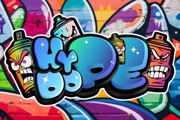
Looking to inject some urban edge into your designs? You’re in the right place! Graffiti fonts bring that raw, unfiltered street energy to everything from logo designs to social media graphics. And here’s the kicker—you don’t need to drop a single penny to access some seriously impressive typefaces.
What Makes Graffiti Fonts So Darn Irresistible?
Let’s face it—there’s something utterly captivating about graffiti fonts. They scream rebellion, creativity, and authenticity all at once. Unlike your standard Arial or Times New Roman (yawn!), these typefaces carry the soul of the streets, the energy of spray cans hissing against concrete walls, and the spirit of artists who transformed urban landscapes into living canvases.
Graffiti fonts aren’t just letters; they’re statements. They’re the visual equivalent of a mixtape from your favorite underground hip-hop artist. Whether you’re designing a poster for a music festival, creating branding for a skateboard company, or just want to add some oomph to your Instagram stories, graffiti fonts deliver that punch you’ve been craving. According to design research from Creative Bloq, urban-inspired typography has seen a massive surge in popularity, with searches increasing by over 300% in recent years as designers seek authentic, bold alternatives to conventional typefaces.
Why Free Doesn’t Mean Cheap (In Quality, That Is)
Now, I know what you’re thinking. “Free fonts? Aren’t those usually garbage?” Well, hold your horses! The landscape of free typography has evolved dramatically. Thanks to talented designers who share their work through platforms like Google Fonts, DaFont, and FontSpace, you can snag professional-quality graffiti fonts without emptying your wallet.
The democratization of design tools has created an incredible ecosystem where passionate creators share their work with the world. Sure, you’ll occasionally stumble upon some duds, but the gems? Oh boy, they’re worth their weight in gold. Plus, many free fonts come with commercial licenses, meaning you can use them for client projects without any legal headaches. Just always—and I mean always—check the licensing terms before using any font commercially.
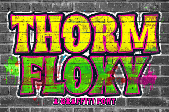
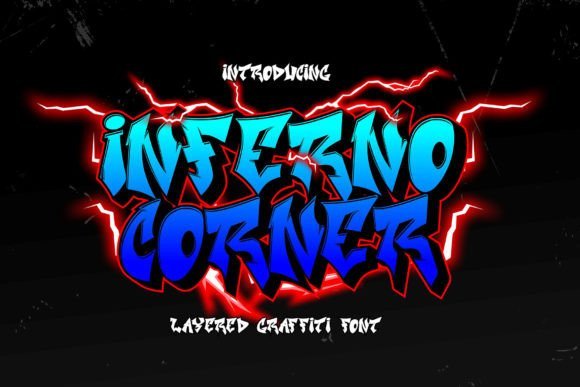
The Ultimate Collection of Best Free Graffiti Fonts
Wildstyle Warriors: For the Hardcore Graffiti Enthusiasts
Graffiti fonts in the wildstyle category are like the PhD level of street art typography. They’re complex, interwoven, and gloriously chaotic.
Aerosol stands as one of the most authentic wildstyle options out there. Created by designer Brian Kent, this font captures that intricate, arrow-laden aesthetic that defined 1980s New York subway art. The letterforms interlock and overlap in ways that would make any graffiti writer proud. You can find it on DaFont, where it’s consistently been one of the most downloaded urban fonts for over a decade.
Subway is another heavy-hitter in this category. It’s got those sharp angles and dynamic flow that make you feel like you’re standing in front of a freshly bombed wall in the Bronx. The beauty of Subway lies in its versatility—it works equally well for large-format prints and smaller digital applications, though I’d recommend using it sparingly for body text since readability can become challenging.
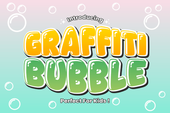
Bubble Letter Bonanza: Soft, Round, and Utterly Charming
Not all graffiti fonts need to be aggressive and angular. Sometimes, you want that friendly, approachable vibe that bubble letters provide.
Bubble Gum does exactly what it says on the tin. This font is playful, chunky, and perfect for youth-oriented brands, candy companies, or anyone targeting a fun-loving demographic. The rounded letterforms have that inflated quality that makes everything feel a bit lighter and more accessible. I’ve seen it used brilliantly in children’s book covers and music festival posters where the organizers wanted to communicate inclusivity rather than exclusivity.
Luckiest Guy from Google Fonts deserves special mention here. While technically inspired by vintage signage, it carries that same bubbly, optimistic energy that makes it perfect for projects needing a graffiti touch without the intimidation factor. The fact that it’s on Google Fonts means it’s web-safe and loads quickly—a crucial consideration for digital designers.
Stencil Style: Military Precision Meets Street Credibility
Stencil graffiti fonts bring together two seemingly contradictory elements: rigid structure and rebellious attitude. They’re reminiscent of Banksy’s work, where political statements meet guerrilla art tactics.
Army Stencil captures this vibe perfectly. The letters have those characteristic bridges that make actual stencils functional while maintaining a raw, utilitarian aesthetic. This font works wonderfully for activist campaigns, urban apparel brands, or any project that needs to convey strength with an edge. According to typography experts at Fonts In Use, stencil-style typography has experienced renewed popularity in contemporary branding, particularly among streetwear and social justice campaigns.
Stencil Revolution takes things up a notch with weathered edges and imperfect alignment that suggests spray paint overspray and hurried application. It’s authentic because it embraces imperfection—something that mass-produced fonts often lack.
Drip and Tag Fonts: When Gravity Gets Involved
Nothing says “fresh paint” quite like drip fonts, where letterforms appear to be melting or running down the surface.
Dripping Marker nails this aesthetic with drips that look genuinely wet and spontaneous. The key to using drip fonts effectively? Don’t overdo it. These typefaces work best for headlines, logos, or accent text rather than entire paragraphs. They’re attention-grabbers by nature, so let them shine in small doses.
Tag Type mimics the quick, flowing hand of a tagger’s marker work. It’s got that rushed elegance—if such a thing exists—where each letter feels like it was executed in one confident sweep. This makes it ideal for brands wanting to communicate authenticity and street cred without seeming too polished or corporate.
Where to Hunt Down These Typographic Treasures
The Big Three Font Repositories
DaFont remains the go-to destination for free fonts of all varieties. Their graffiti section is particularly robust, with hundreds of options sorted by popularity, newest additions, and name. The site’s been around since 2000, and while the interface isn’t fancy, the selection is unbeatable.
FontSpace offers a similar breadth but with better filtering options. You can search specifically for fonts with commercial licenses, which saves time if you’re working on client projects. They also provide preview tools that let you type custom text to see how it looks before downloading—super handy!
Google Fonts might surprise you. While they don’t have a “graffiti” category per se, searching terms like “display,” “handwriting,” or specific font names yields several urban-inspired options that are 100% web-safe and open-source.
Designer Portfolios and Behance
Don’t sleep on Behance! Many typography designers share free fonts as passion projects or portfolio pieces. The advantage here is that you’re often getting cutting-edge designs before they become mainstream. Plus, you can usually contact the designer directly if you have questions or need a custom variation.
Pairing Graffiti Fonts with Other Typefaces (Without Creating a Visual Disaster)
Here’s where things get tricky. Graffiti fonts are bold personalities—they want all the attention. Pairing them with other typefaces requires finesse.
The golden rule? Contrast is your friend. If you’re using a heavy, ornate graffiti font for your headline, pair it with something clean and minimal for body text. Think Helvetica, Open Sans, or Lato. The simplicity of these sans-serif workhorses lets your graffiti font shine without competing for attention.
Conversely, if you’re using a more restrained graffiti style (maybe a simple tag font), you could pair it with a sturdy serif for body text—something like Georgia or Merriweather. This creates an interesting tension between street culture and traditional typography that can work brilliantly for editorial designs or cultural publications.
Never—and I mean never—pair two different graffiti fonts in the same design unless you’re deliberately going for chaotic maximalism. Even then, proceed with extreme caution. Multiple competing graffiti typefaces usually result in visual cacophony rather than creative genius.
Technical Considerations: Installing and Using Your New Fonts
Installation Basics Across Different Systems
On Windows, installing fonts is straightforward. Download the font file (usually .ttf or .otf), right-click it, and select “Install.” Boom! It’s now available in all your applications. For Mac users, double-click the font file and hit “Install Font” in the Font Book application that pops up.
For web use, you’ll need to either host the font files yourself or use a web font service. Google Fonts makes this dead simple with embed codes you can paste directly into your HTML. For custom fonts, you’ll need to use CSS’s @font-face rule, which sounds scarier than it actually is.
Optimizing for Different Applications
Print versus digital requires different considerations. For print work, graffiti fonts typically look best at larger sizes—think posters, T-shirts, or album covers. The intricate details that make these fonts special can get muddy at small sizes, especially in lower-quality printing.
For digital applications, particularly web design, file size matters. Some graffiti fonts come with extensive character sets and alternates that bloat the file size unnecessarily. Many font editing tools like FontForge (free and open-source!) let you subset fonts to include only the characters you need, dramatically reducing load times.
Legal Stuff: Understanding Font Licenses (It’s Not as Boring as It Sounds!)
Okay, I lied—it’s a bit boring, but it’s also super important! Not all free fonts are free for commercial use. Some are designated for “personal use only,” meaning you can use them for your own projects but not for client work or anything you’re selling.
Look for terms like “100% Free,” “Commercial Use Allowed,” or “Open Source License.” Creative Commons licenses are also great—just make sure you understand which specific CC license applies. CC BY allows commercial use with attribution, while CC BY-NC prohibits commercial applications.
When in doubt, reach out to the designer! Most are flattered that you want to use their work and will happily clarify licensing terms. Plus, if you’re using their font for a cool project, they might even share it on their portfolio (free publicity for you!).
Real-World Applications: Where These Fonts Truly Shine
Music and Entertainment Industry
Hip-hop artists, electronic musicians, and alternative bands have long embraced graffiti fonts for album covers, promotional materials, and merchandise. The aesthetic alignment is obvious—both graffiti and these music genres emerged from similar countercultural movements and continue to share values of authenticity and rebellion.
Youth-Oriented Brands and Products
Energy drink companies, skateboard manufacturers, and streetwear brands use graffiti typography to communicate directly with their core demographic. These fonts signal “we get you” to young consumers who value authenticity over polish.
Event Promotion
Music festivals, art shows, and community events frequently deploy graffiti fonts to capture attention and communicate the vibe. A jazz festival probably won’t use a dripping wildstyle font, but an underground electronic music event? Absolutely perfect.
Common Mistakes to Avoid (Learn from Others’ Blunders!)
Overuse is mistake number one. Just because you’ve discovered the perfect graffiti font doesn’t mean every project needs it. Fonts are like hot sauce—amazing in the right context, overwhelming when overused.
Ignoring readability is another common pitfall. That intricate wildstyle font might look incredible, but if your audience can’t decipher what it says within three seconds, you’ve failed. Always prioritize communication over aesthetics, even when working with decorative fonts.
Forgetting about context can make your designs feel tone-deaf. Using graffiti fonts for a law firm’s branding? Probably not. For a youth community center? Perfect! Consider your audience and the message you’re sending.
Customizing and Modifying Fonts for Unique Results
Once you’ve got your fonts installed, don’t stop there! Most design software allows for creative manipulation that can make even free fonts look custom.
Layer effects in programs like Photoshop or Illustrator can add dimension. Try adding outer glows, drop shadows, or multiple strokes to create that spray paint depth. You can also apply texture overlays—concrete textures, paper grains, or spray spatter patterns—to enhance the street art authenticity.
Color experimentation transforms fonts entirely. While black is classic graffiti, don’t be afraid to explore vibrant gradients, neon colors, or even metallic effects. The beauty of digital design is that experimentation costs nothing but time.
The Evolution of Graffiti Typography: From Subway Cars to Digital Screens
Understanding the history enriches how we use these fonts today. Graffiti typography emerged in the 1960s and ’70s as young artists in Philadelphia and New York began developing distinctive lettering styles. Tags evolved into elaborate pieces, and different cities developed unique aesthetic signatures.
According to design historian Steven Heller’s work documented on AIGA Eye on Design, graffiti’s influence on mainstream typography became undeniable by the 1980s, when designers began incorporating street art elements into commercial work. Today, that influence is everywhere—from corporate branding to app interfaces.
This historical context matters because it reminds us that graffiti fonts carry cultural weight. They’re not just trendy design elements; they represent artistic movements, community identity, and often, social resistance. Using them thoughtfully means acknowledging that heritage.
Accessibility Considerations: Making Bold Choices That Everyone Can Enjoy
Here’s something often overlooked: decorative fonts like graffiti typefaces can create accessibility challenges. People with dyslexia, visual impairments, or reading difficulties may struggle with highly stylized letterforms.
The solution? Use graffiti fonts strategically for headlines and emphasis while maintaining clean, readable fonts for body text. Ensure sufficient color contrast—those light-colored drip fonts on pale backgrounds might look cool but fail WCAG accessibility standards miserably.
For web projects, always include proper fallback fonts in your CSS stack. If a user’s browser can’t load your custom graffiti font for whatever reason, they should still see something intentional rather than default system fonts.
Future Trends: Where Graffiti Typography Is Heading
Variable fonts represent an exciting frontier. These fonts contain multiple variations within a single file, allowing real-time adjustments to weight, width, and other attributes. Imagine a graffiti font where you could adjust the “drippiness” or the “roughness” on the fly—that’s becoming reality.
Animated typography is another growth area. With tools like After Effects and web animation libraries becoming more accessible, we’re seeing graffiti fonts that animate to mimic the spray painting process or that incorporate motion in their letterforms. It’s street art meeting digital innovation.
Wrapping Things Up: Your Typography Toolbox Just Got Seriously Upgraded
So there you have it—everything you need to know about finding, using, and maximizing the best free graffiti fonts available today. From wildstyle warriors to friendly bubble letters, the options are genuinely incredible.
The key takeaways? First, free doesn’t mean inferior quality—there are professional-grade options available at zero cost. Second, always check licensing before using fonts commercially. Third, use these bold typefaces strategically; they’re powerful design elements that work best when given room to breathe.
Whether you’re designing for a client, creating personal projects, or just experimenting with typography, graffiti fonts offer a unique way to inject personality and edge into your work. They connect contemporary design to street culture’s rich history while remaining utterly relevant in today’s visual landscape.
Remember, the best designs come from understanding not just how to use these tools but why they work. Graffiti fonts succeed because they’re authentic, bold, and unapologetically themselves—qualities that resonate across demographics and design applications.
Now get out there and make something amazing! And hey, when you create something incredible with these fonts, don’t forget to give credit where it’s due. The designers who share their work freely with the community deserve our appreciation and recognition.
Frequently Asked Questions About Free Graffiti Fonts
Q: Can I really use free graffiti fonts for commercial projects?
A: It depends on the specific font’s license! Many free fonts do allow commercial use, but some are designated “personal use only.” Always check the license file that comes with the font or review the terms on the download site. When in doubt, contact the designer directly—most are happy to clarify and may even offer commercial licenses at reasonable rates if the free version doesn’t include commercial rights.
Q: Why do some graffiti fonts look pixelated or weird when I install them?
A: This usually happens when you’re viewing the font at very small sizes or in software with poor font rendering. Graffiti fonts are typically designed for larger display sizes (headlines, posters, etc.) rather than body text. Try increasing the size—most look much better at 36pt or larger. Also, ensure you’ve downloaded the full version of the font rather than a demo version, which might have limited characters or lower quality.
Q: What’s the difference between TTF and OTF font formats?
A: Both TrueType Font (TTF) and OpenType Font (OTF) formats work great for most applications. OTF is newer and supports more advanced typographic features like ligatures and alternate characters, which can be especially useful for graffiti fonts that often include stylistic variations. That said, for basic use, either format works perfectly fine on both Mac and Windows systems.
Q: How many fonts should I use in a single design project?
A: As a general rule, stick to 2-3 fonts maximum in any design. If you’re using a bold graffiti font, that should typically be your only decorative typeface, paired with one clean sans-serif for body text and maybe a complementary font for supporting elements. More than that usually creates visual chaos rather than sophisticated design.
Q: Are there graffiti fonts that work well for website body text?
A: Honestly? Not really. Graffiti fonts are decorative by nature and sacrifice readability for style—the exact opposite of what you want for body text. Use them for headlines, buttons, navigation elements, or accent pieces, but always pair them with clean, readable fonts like Open Sans, Roboto, or Lato for paragraphs and longer text blocks.
Q: What resolution should I use when working with graffiti fonts for print?
A: Always work at 300 DPI (dots per inch) minimum for print projects. Graffiti fonts often have intricate details, rough edges, or texture effects that can look muddy at lower resolutions. For large-format printing like posters or banners, consult with your printer, but 150-300 DPI is typically standard depending on viewing distance.